
“Panic”, “Anxiety”
11 x 17
Photoshop
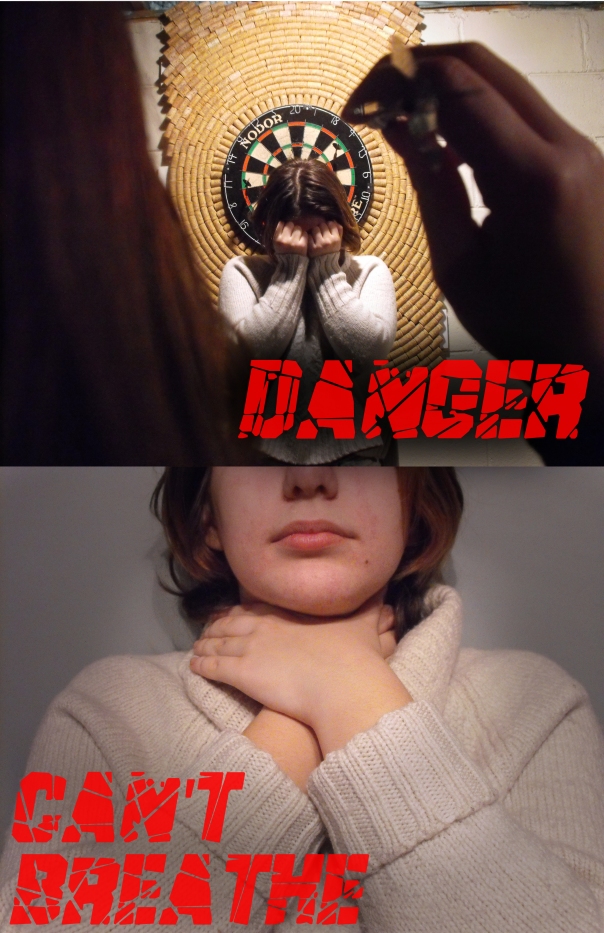
With this piece, I really wanted to convey the true anxiety, panic, fear, stress, and how overwhelming it is to have a panic/anxiety disorder. I didn’t want to talk about the positives this time, because while they are important, I feel like people don’t talk about how it actually feels enough. While it is good to focus on the positive, we can’t entirley ignore the negative. It needs to be recognized and understood so that we know how to act and react. We need to realize the struggle people deal with everyday of their lives, how it feels, and how truly terrifying it can be to have your brain fighting against you all the time and not being able to control it.
This is important to me because of my own personal struggle, friends, family, and people around me everyday who are internally fighting a battle with themselves all the time. From this piece, I want people to take away sympathy and understanding. For people to take just a little bit of time out of their lives and do a bit of research, not to pity, but to sympathize.
The artist who inspired me heavily during the creation of this piece is Christian Sampson (I made a separate post where I talk about him and his work: https://fightingnightmares.wordpress.com/2017/01/25/christian-sampson-inspiration/ )
The elements of design I used in this piece are implied line, value, and colour. The dart in “Panic” points directly at it’s target, which is the focal point. It shows our eyes where to look. As well as in “Anxiety” the pen on the notepad points down to the paper, leading our eyes with an implied line. Value is shown by using a dark tint around the focus to make the focal area pop more, using dark and light space. Lastly, I used the bright red font on the words to make them intensely pop.
The principles of design I used are balance, and emphasis. I balances the images asymmetrically by placing the words on both sides of the images. I used emphasis on the focal points by darkening the area around the focal point.
The principles of media art that I used are physical point of view and conceptual point of view. The physical point of view is seen through closeups, and how it looks as though in the top image of “Anxiety” we are looking from the writers perspective. The conceptual point of view is my topic of Anxiety and Panic, the struggles, the fear, and the intensity.
Strengths of this piece are the Points of view, both conceptual and physical, as well as my emphasis on the focal point.
Weaknesses of this piece are that I made both images very simply. While I did focus on some detail like the individually written pages in “Anxiety”, I wasn’t able to add as much as I would’ve liked.
The biggest challenged faced was time. Due to many snow days and being sick I had less time than planned to work on the piece. I had a whole other image planned focusing on Depression that I wasn’t able to do and details were lost. I also had trouble initially coming up with my idea in the first place. I struggled to choose between different topics, but am satisfied with my choice of focusing on mental health. The last challenge I faced is that WordPress seems to want to reduce the quality of my photo’s so unfortunately they’re not quite as clear as I made them.
