All posts by fightingnightmares

Panther Poster

Panther Poster - Matt Correia.png

Panther Poster

17 x 11

Photoshop

This assignment was to make a poster showing our school mascot panther setting a good example for using the web. Our piece needed to include a picture of the panther, and text following the template: “This is panther, Panther…{good example of using the internet}… Be like panther.”

I made this fairly quickly. I’m not a huge fan with how it turned out, but it met the requirements and I completed the assignment. If I could do it again, I’d take more time with how I took the photo. I also would’ve photoshopped in a Facebook feed onto the computer screen instead of just having the login page. I also would’ve directed my subject more to lower the panther head, since it looks like the person inside the suit is looking at the screen rather than the panther.

Mixed Media / Gel Transfer

20170614_084239(1)

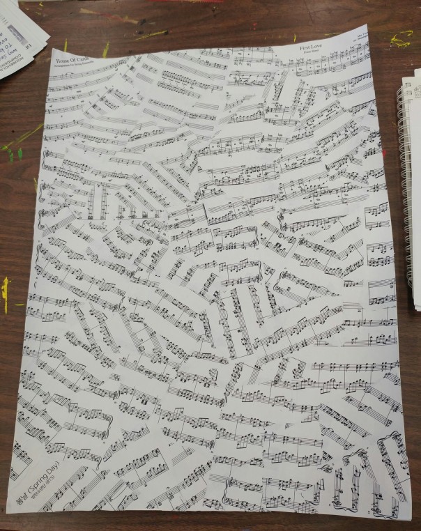
This is the final product of my Mixed Media / Gel transfer assignment.

I made this with lots of layering of printed paper, wall paper, pen, and paint.

The first thing I did was make a collage of sheet music from three songs by the Korean Pop group BTS (First Love, Spring Day, and House of Cards). I choose these songs because they had free sheet music for them that had dynamic and wasn’t the same notes over and over again, and they some have piano in them, which is what the sheet music is for.

Ttcc02v

After collaging the sheet music I cut out strips of wallpaper and excerpts from the short story The Ones Who Walk Away From Omelas by Ursula K. Le Guin. I choose this short story because you can see the word “Omelas” on a motel in the music video for BTS’s Spring Day. I used black pen to make a small border.

I then did my gel transfers, printing free-use/copyright-free images of butterfly’s and a tree and used the gel to transfer the ink onto the piece. Lastly I used a stencil to add the pink flower in the bottom right corner.

If I could do this again I’d give myself more time, cut out the sheets of paper and wallpaper neatly, and make a better border, maybe with lace-tape or ribbon instead of pen. I also wouldn’t made the stencil cleaner and gotten more of the paper pulp off of the transfers.

Voltron Laptop Skin Design: Final Product

aaa

Form Cat-tron

12 x 8

Photoshop / Illustrator

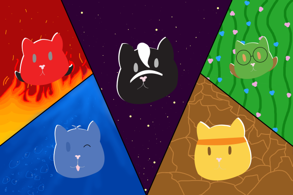
This design is inspired by the Netflix Original Series – Voltron: Legendary Defenders. I used a screen-split formation used in the show and put cat versions of each character in their respective spots. The backgrounds represent their main focus, abilities, and personalities.

The first thing I did to make this was trace my sketches of the cat heads into Illustrator. Then, in Photoshop, I separated the screen and drew the backgrounds. After that, I put the Illustrator cat head files into photoshop. I duplicated the layers of the cat heads and took away the saturation to make a white version of the cat heads to put behind to create a white “shadow”/highlight.

Screen Shot 2017-06-08 at 9.19.49 AM

Lastly I places my design on the GelaSkins template and cropped the edges in photoshop.

This has probably been my favourite project so far. It’s not perfect or top-quality, but I can see myself improving the more I practice these programs. I like how it turned out and I can’t wait to continue to practice and improve.


Some Elements of Design Used

Colour: I used colour to represent each character presented. I generally used a colour scheme in each section. Top left: Analogous (Reds, Oranges, Yellows), Bottom left: Monochromatic(Blues), Middle: Complementary (Purple and Yellow), Bottom right: Monochromatic (Yellows made browns)

Line: I used literal lines to separate each section from the other, but it also leads the viewers eyes from each section back to the middle.

Laptop Skin Design: Sketch

Sketch

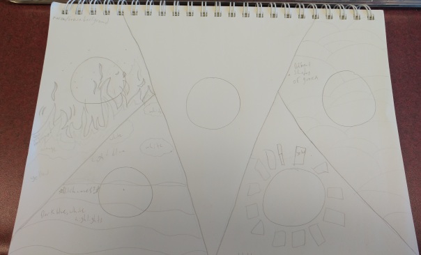
This sketch is of the background. I have it split up into 5 sections, inspired by a frame from the Netflix Original series: Voltron Legendary Defenders. The top left having fire, bottom left water, middle space, bottom left sunshine, top left earthy.

These sections give a small insight to their respective character’s personality and main ability.

Cats Sketch

I sketched cat head versions of the shows 5 main characters, which will be placed where the circles are in my sketch of the background.

Culminating: Finished Product

20170525_09343420170525_093510

Tools/Materials Used: Adobe Illustrator, Gel Matte, Stencils, Acrylic Paint, Lazer Printer

Principles of Media Art: Point of view, Hybridization, Interactivity

I had fun making this assignment, although it didn’t turn out the best I learned a lot about the program Adobe Illustrator and about making things with my hands. It’s a lot of work and I definitely need more practice but I’m glad for this experience.

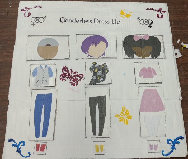
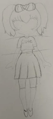
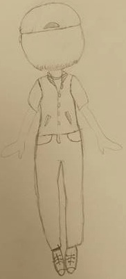
I think the best part of this final product is the point of view. The message I’m trying to send is very prominent, as the title is “Genderless Dress Up”. I was to promote the fact that anyone should be able to wear whatever they want to express themselves however they please no matter their gender, sexual-orientation, race, etc.

The interactive portion of this is that the viewer is able to move around each piece and rearrange the clothing, head, and shoes of each person.

Hybridization is shown here through using different mediums to create a finished product. I made the clothes, heads, and shoes on Adobe Illustrator, which the other aspect where made with paint and cardboard.

If I could do this assignment again, I’d be sure to give myself more time. I’d also make it so the dividers between the movable pieces have some way to connect each piece and to have the head not move. I’d also take more time to design the actual title and edges to make it more visually pleasing.

Culminating: Artist Inspiration

An artist, or rather a clothing company, has inspired me during my culminating project. The company is called The Discriminant. It’s a trendy and affordable online store based in New York. They focus on quality of service and products rather than gender and gender norms. They provide a variety of items sold without label restrictions because they don’t believe in putting boundaries to self-expression.

The Discriminant has inspired my project by giving me outfit ideas for my three outfits (male, female, and androgynous) that I will be making. They also share the same point of view as me, as we see clothes without genders. Label followed by their stereotypes are restricting and by removing them, we can all be free to express ourselves in which ever way we want, and the way that makes us happy, instead of focusing on what others expect of us.

You can find there website here: https://www.thediscriminant.com/

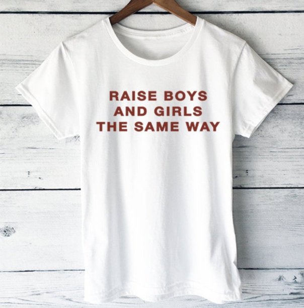
Here are examples of some of their many clothing items available:

Screenshot20170502-152855_2048x2048

THE AUREN

“Raise boys and girls the same way”


product-image-155315760_2048x2048

THE BETTE


product-image-56818239_2048x2048

THE CANNON

“Everything will be ok”

Black + White Portrait: Original Photo

Untitled-4

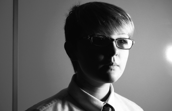
This is my original photo (the one I traced) for my black and white portrait.

The biggest challenge I faced was accepting a photo of my face that I thought was acceptable (I’m my own worst critic when it comes to pictures of me). I also had to move to the second light option in the room, as the first one just wasn’t working and was making the photo’s very unflattering.

If I could change something about this photo, I would’ve flattened my hair up in the back, since it looks pretty messy back there.

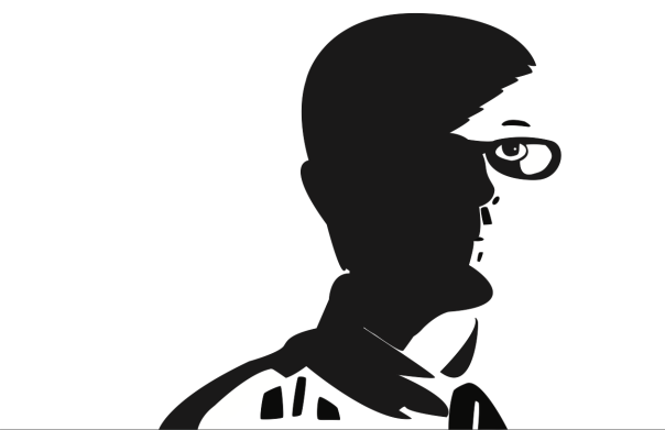
Black + White Portrait Step 3: Final Product

Screen Shot 2017-04-07 at 9.43.32 AM

Step 3 was to smooth out our image from step 2.

At first I was certain that I was going to prefer the geometric look of step 2, more so than I was going to enjoy the smoother look, but I was wrong. Although step 2 does have it’s pro’s, as I explained in that post, I like this better as it is more smooth, and pleasing to the eye. It makes the image easier to look at, and lets the view’s eyes glide across the image, rather than in sharp movements.

I faced quite a few challenges with this step, mostly because I was unfamiliar with the program Adobe Illustrator, only having used it for typography before. I found the tool we were originally taught to use, only worked well for some areas, so I had to play around with the program and ask a friend for some tips before I got the hang of it.

I mainly used the pen tool for rounding out my edges, by not fully enclosing the points, but instead clicking and dragging to round them out, connecting them after they had been rounded.